Have you ever walked into a room and instantly felt calm, or maybe energized? You might not realize it, but the colors around you play a big part in how you feel. Colors have the power to affect our emotions, thoughts, and even how we behave. This idea is known as color psychology, and it’s especially important when it comes to designing your home.
When you’re choosing colors for your house, you’re not just picking what looks pretty. You’re also deciding how the space will feel. Will it be a relaxing place to unwind, or a bright, lively room where you want to get things done? Let’s take a look at how different colors work and how you can use them to create the perfect atmosphere in every room of your home.
Why Color Affects Mood
Before we get into the details of how specific colors make us feel, it’s helpful to understand why color affects us in the first place. Colors have different wavelengths of light, which impact how our brains process them. Over time, humans have developed certain emotional responses to colors, based on nature and cultural experiences.
For example, the color red is often associated with fire and blood, making it a symbol of danger or excitement. Blue, on the other hand, is linked to the sky and water, which is why many people find it calming.
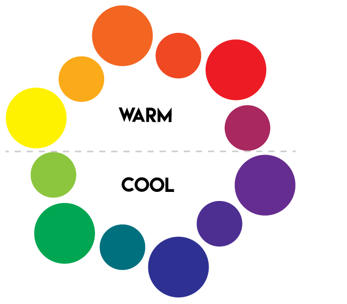
Warm vs. Cool Colors
One of the easiest ways to think about colors is to divide them into two categories: warm and cool colors. Warm colors include red, orange, and yellow. Cool colors include blue, green, and purple. These two groups create very different feelings.
- Warm colors are energizing and lively. They are great for rooms where you want to feel active and social.
- Cool colors are calming and peaceful. They work best in places where you want to relax or focus.
Let’s explore the effects of individual colors and see how you can use them in your home.
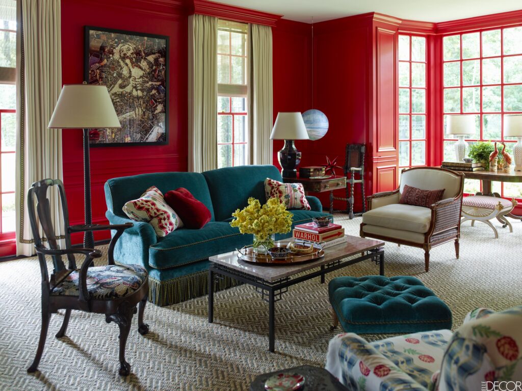
Red: Exciting and Bold
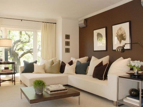
Red is one of the most powerful colors when it comes to creating emotion. It’s known for boosting energy and grabbing attention. This makes it a great choice for rooms where you want to feel alert and lively, like a dining room or an entertainment area.
Best places to use red:
- Dining rooms (it can even increase appetite!)
- Living rooms
- Entryways
However, red can be overwhelming if you use too much of it. A bright red bedroom, for example, might make it hard to relax. So, if you love red, consider using it as an accent color—like in pillows, art, or rugs—rather than painting all the walls.
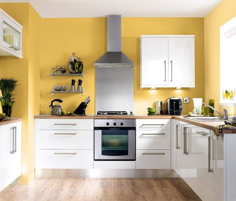
Yellow: Cheerful and Optimistic
Yellow is the color of sunshine, and it’s known for being cheerful and happy. If you want to create a room that feels bright and welcoming, yellow is a great choice. It’s perfect for kitchens or breakfast nooks, where you want to start your day feeling positive and energized.
Best places to use yellow:
- Kitchens
- Dining areas
- Hallways
Just like red, too much yellow can become overwhelming or make people feel anxious, so it’s a good idea to balance it with more neutral tones, like white or light grey.
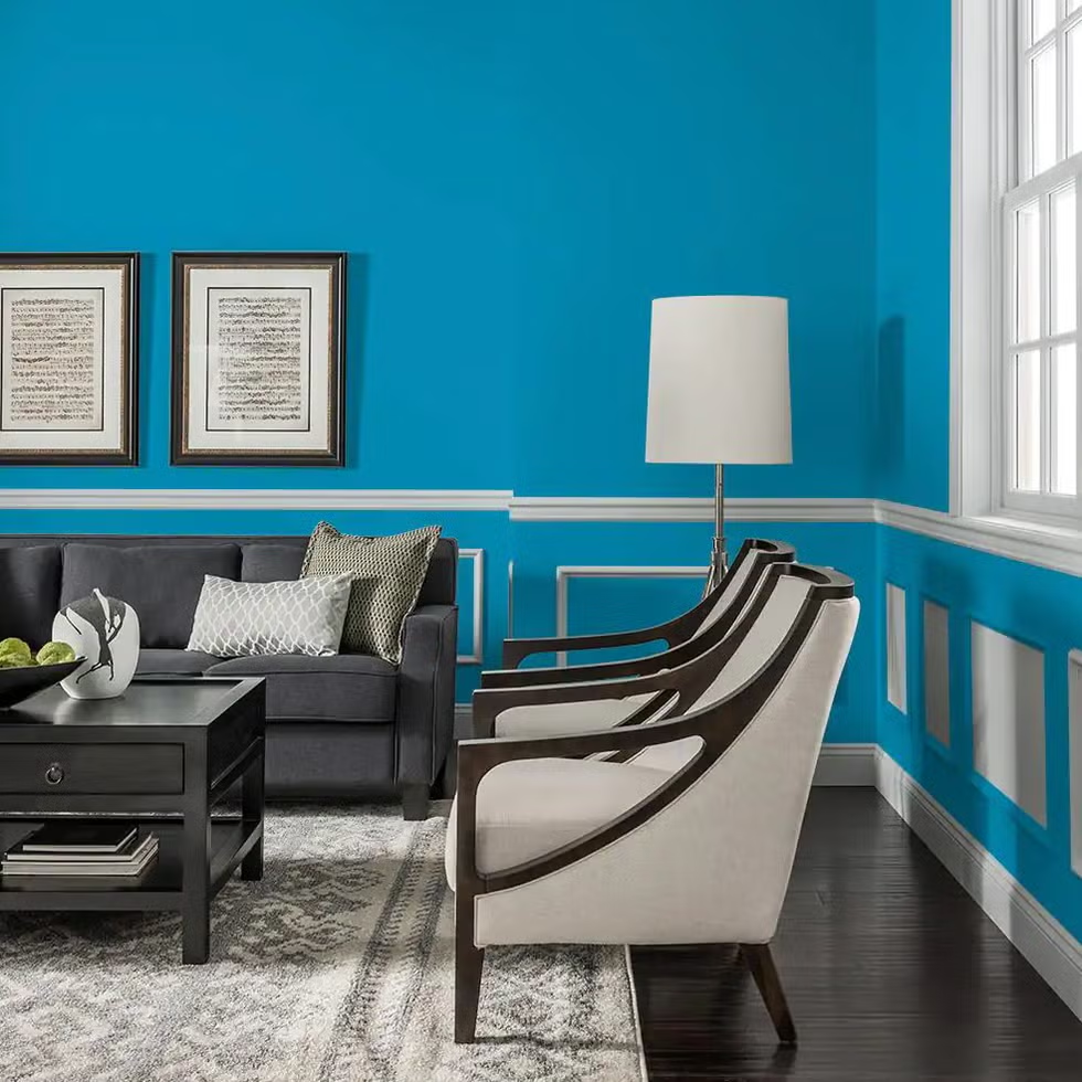
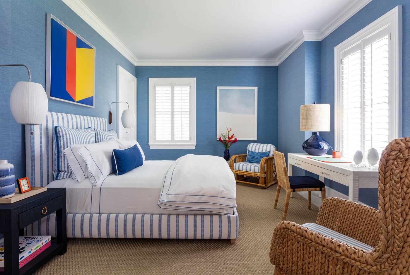
Blue: Calm and Soothing
Blue is one of the most popular colors for home design, and it’s no wonder why. It’s associated with the sky and the ocean, both of which give off peaceful, soothing vibes. Blue lowers your heart rate and can help reduce stress, making it a perfect choice for bedrooms, bathrooms, or any room where you want to relax.
Best places to use blue:
- Bedrooms
- Bathrooms
- Home offices
One thing to keep in mind is that darker blues can make a room feel smaller and colder. If you’re decorating a small room, go for lighter shades of blue to keep things feeling fresh and airy.
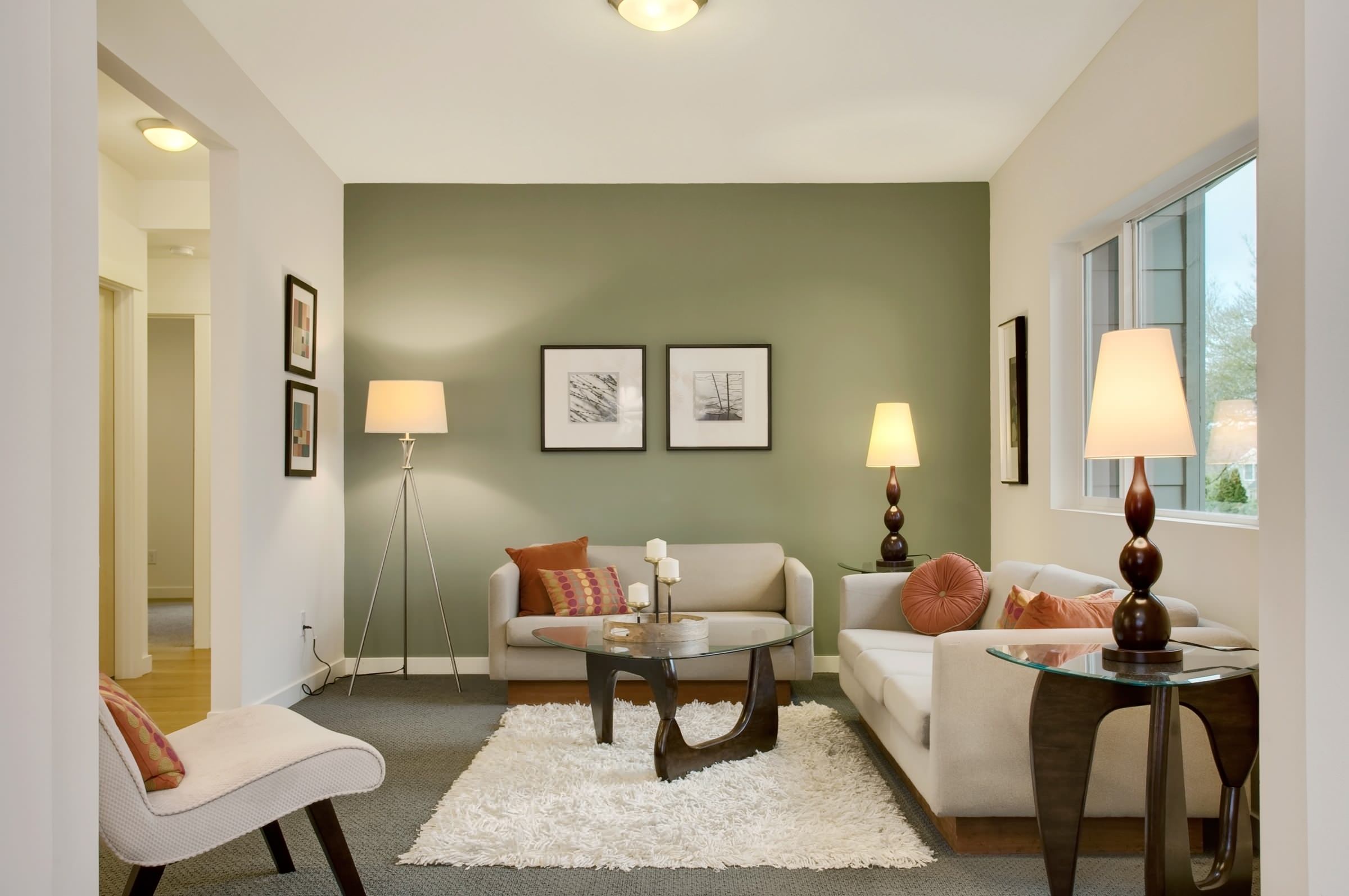
Green: Balanced and Refreshing
Green is the color of nature, so it’s no surprise that it’s known for being refreshing and balanced. It’s the perfect blend of the calmness of blue and the energy of yellow, which makes it a very versatile color. Green can work in almost any room because it creates a peaceful, grounded feeling.
Best places to use green:
- Living rooms
- Bedrooms
- Home offices
Lighter shades of green, like mint or sage, work well in spaces where you want to relax. Darker greens can add elegance and richness to a room but might feel too intense in smaller spaces.
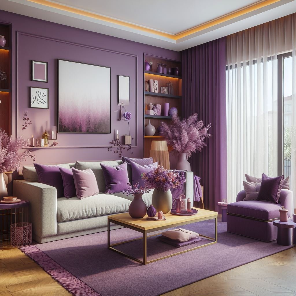
Purple: Luxurious and Creative
Purple is often linked with royalty and luxury. It’s also a color that sparks creativity, so it’s great for artistic spaces like a home studio or reading nook. Lighter shades of purple, like lavender, can bring a peaceful and romantic feeling to bedrooms, while deeper purples, like plum, create a sense of richness and drama.
Best places to use purple:
- Bedrooms
- Creative spaces (like studios)
- Living rooms (for a luxurious touch)
Because purple can be a strong color, it’s best to use it thoughtfully. Like with red, you can use purple as an accent color to avoid overwhelming a room.
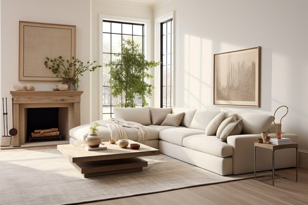
Neutral Colors: Timeless and Versatile
Neutral colors like white, grey, beige, and taupe may not seem exciting, but they play an important role in home design. These colors are calming and versatile, making them a great backdrop for bolder colors. You can think of them as a blank canvas that allows your furniture, artwork, and accessories to stand out.
Best places to use neutral colors:
- Anywhere! Neutrals work in all rooms.
White can make a room feel larger and more open, while grey adds a modern, sleek look. Beige and taupe bring warmth to a room without overpowering other colors.
Combining Colors for the Best Effect
While each color has its own effect, it’s important to remember that colors rarely exist on their own. Most rooms will have a mix of colors, and how these colors interact can change the overall feel of a space.
Here are some tips for combining colors:
Start with a neutral base. Use neutral colors for the larger elements in a room (like walls and furniture) and add pops of color through smaller items like pillows, rugs, and artwork.
Use contrasts carefully. Pairing opposite colors (like red and green) can create a striking look, but it can also be jarring if overdone. Stick to small doses of contrast.
Balance warm and cool tones. If a room feels too warm and energetic, try adding cool accents like blue or green to calm it down. Similarly, if a space feels too cold or clinical, warmer tones can make it feel cozier.
Final Thoughts: Creating the Right Mood for Every Room
When it comes to designing your home, color is one of the most powerful tools you have. The colors you choose can change how you feel, how you behave, and even how you think. Whether you want a space to be energizing, calming, or inspiring, there’s a color that can help you achieve that goal.
By understanding the psychology behind colors, you can create a home that not only looks beautiful but also feels just right. So next time you’re picking out paint or décor, take a moment to think about how each color makes you feel—and how it can transform your space.

